First Stage: App Discovery Call
An App Discovery Call is the first contact an app designer has with the customer. The customers I normally work with usually have a small team and need extra assistance with the building and maintenance of their app.
During these calls, we typically meet over Zoom or Google Hangout. I ask the customer a series of questions and take notes based on their answers. These calls inform my decisions later on when building and designing their app.
The main point of contact for First Baptist Church of Elgin (FBCE) informed me during our call that he and his team had recently updated their website and wanted the app to match its branding while also having its own identity with a modern and refreshed look. After showing him examples of previously made apps, the customer pointed out one he liked the most and asked if I could create something similar to his selection.
Second Stage: Building the App
When working on the app, I first focused on what type of content the customer expressed he wanted to see in the app and where it would make the most sense to be located based on what we discussed. Once I was able to establish a foundation with the desired features, I began to think about design and how I could accurately represent the church’s branding in a sleek and modern way.

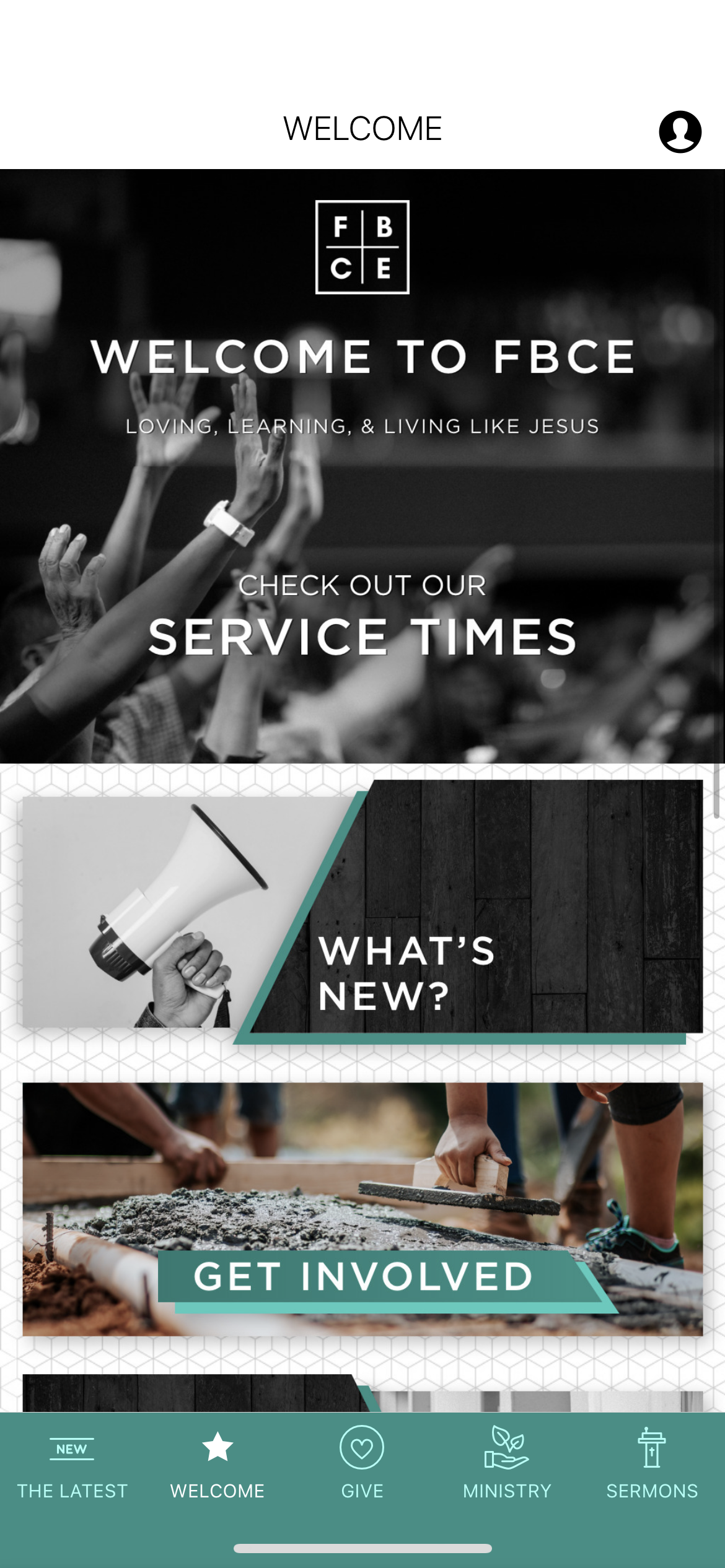
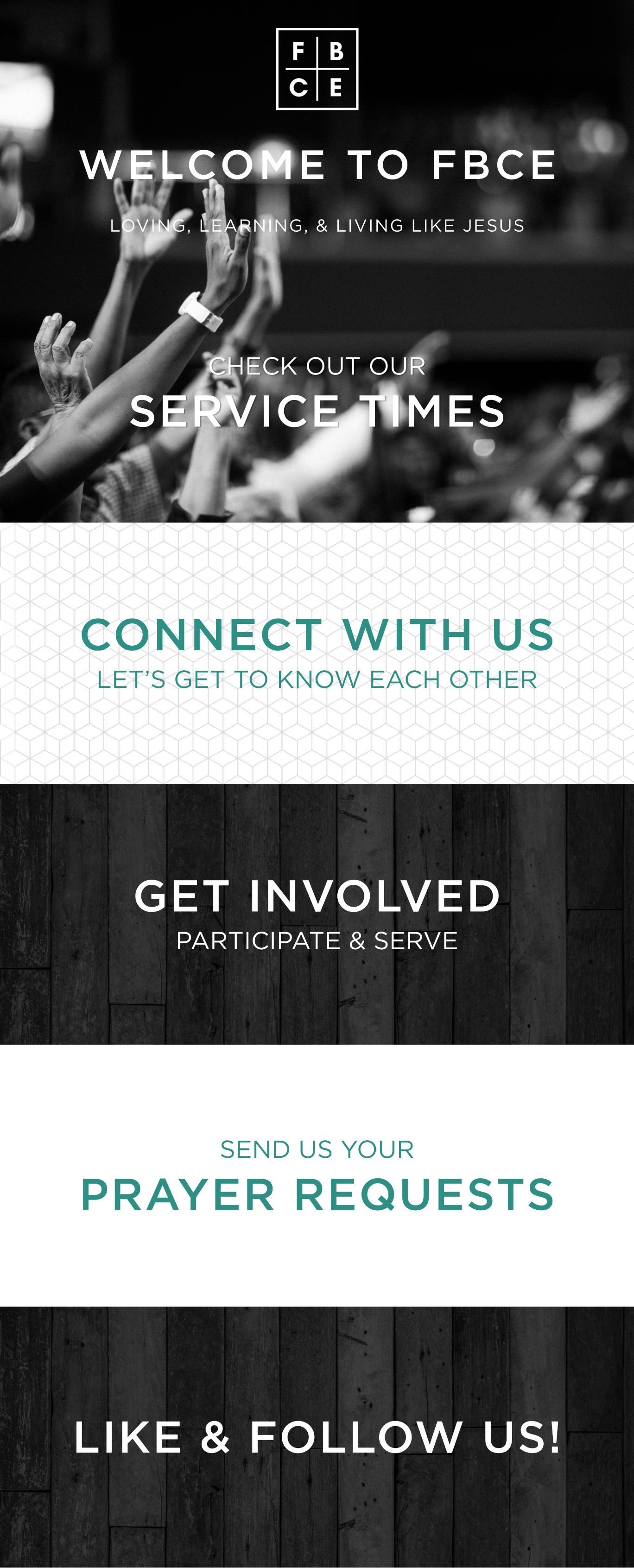
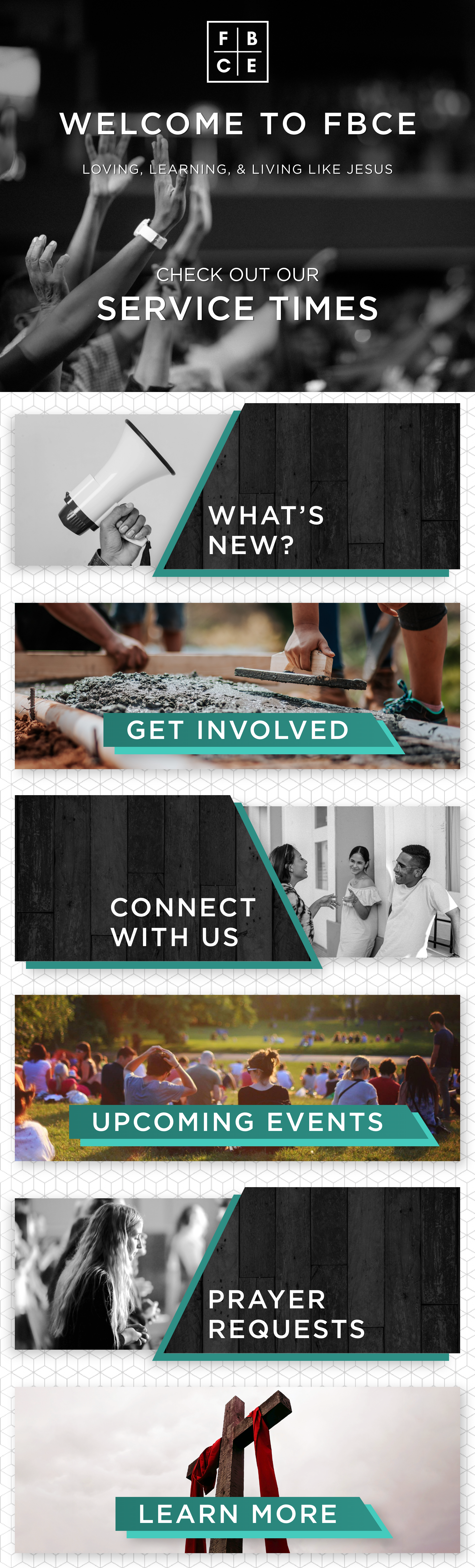
The first image that appears on their website is a black and white stock photo with an overlay of FBCE’s logo and mission statement. The image on the website was flattened, which gave me less flexibility on sizing and placement while trying to replicate it for the app. However, I recognized the stock photo, which I was able to locate and download from pexels.com. I then used the same font seen in the image to type out their mission statement. I used the logo file that was given to me to resize and place on the stock image where end-users would be able to recognize the church’s branding while appropriately sized for a mobile screen.
I was also able to replicate the patterned background and re-use the grayscale image of wooden boards in the app in a different way while also ensuring everything was clearly related to the website.
Iterations
While I already knew my first iteration of the Welcome section was not going to work, it helped me figure how I could place the background pattern and images into the appropriately sized artboards.
The current version of the Welcome section is much closer to the example the customer favored during our Discovery Call. After creating the panoramic menu layout that is currently being used, I focused on other areas of the app that I could add elements of FBCE’s branding.
FIRST ITERATION
FINAL VERSION
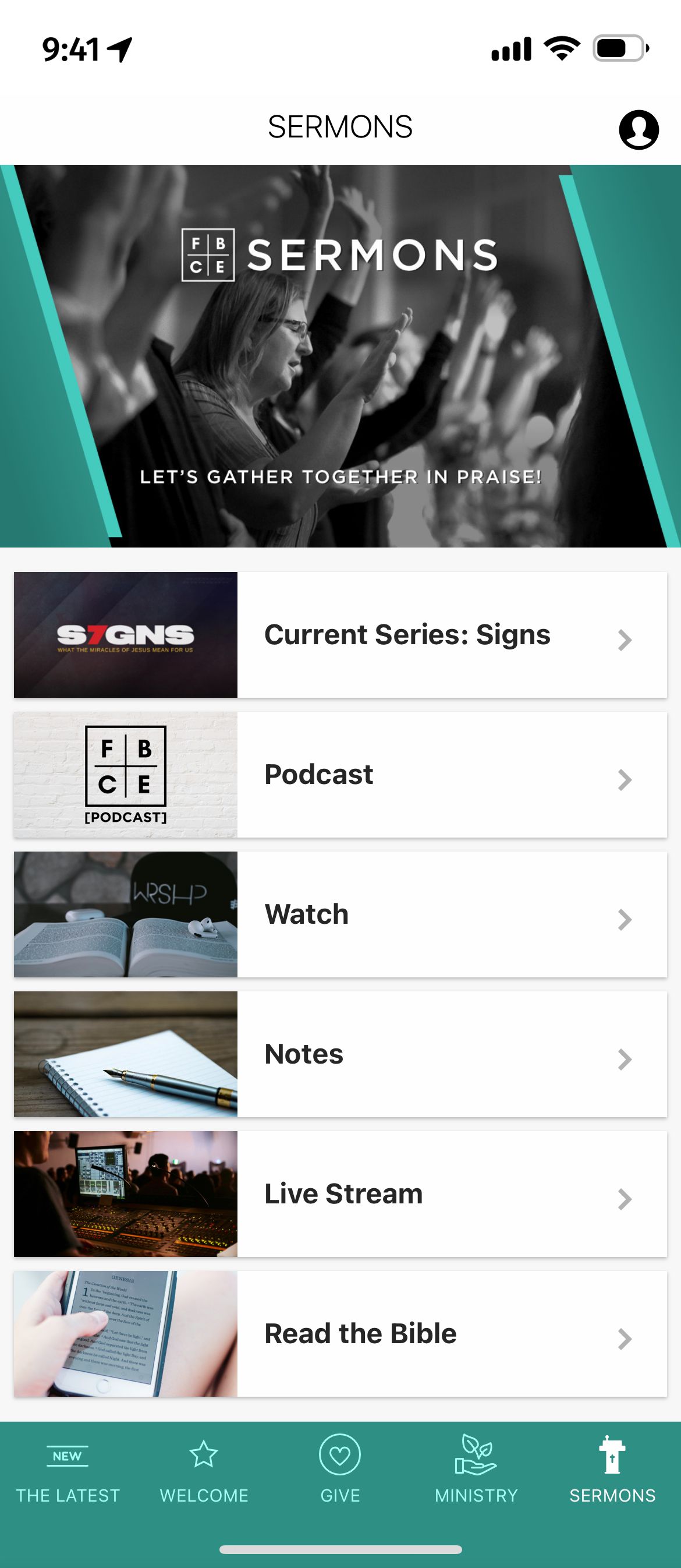
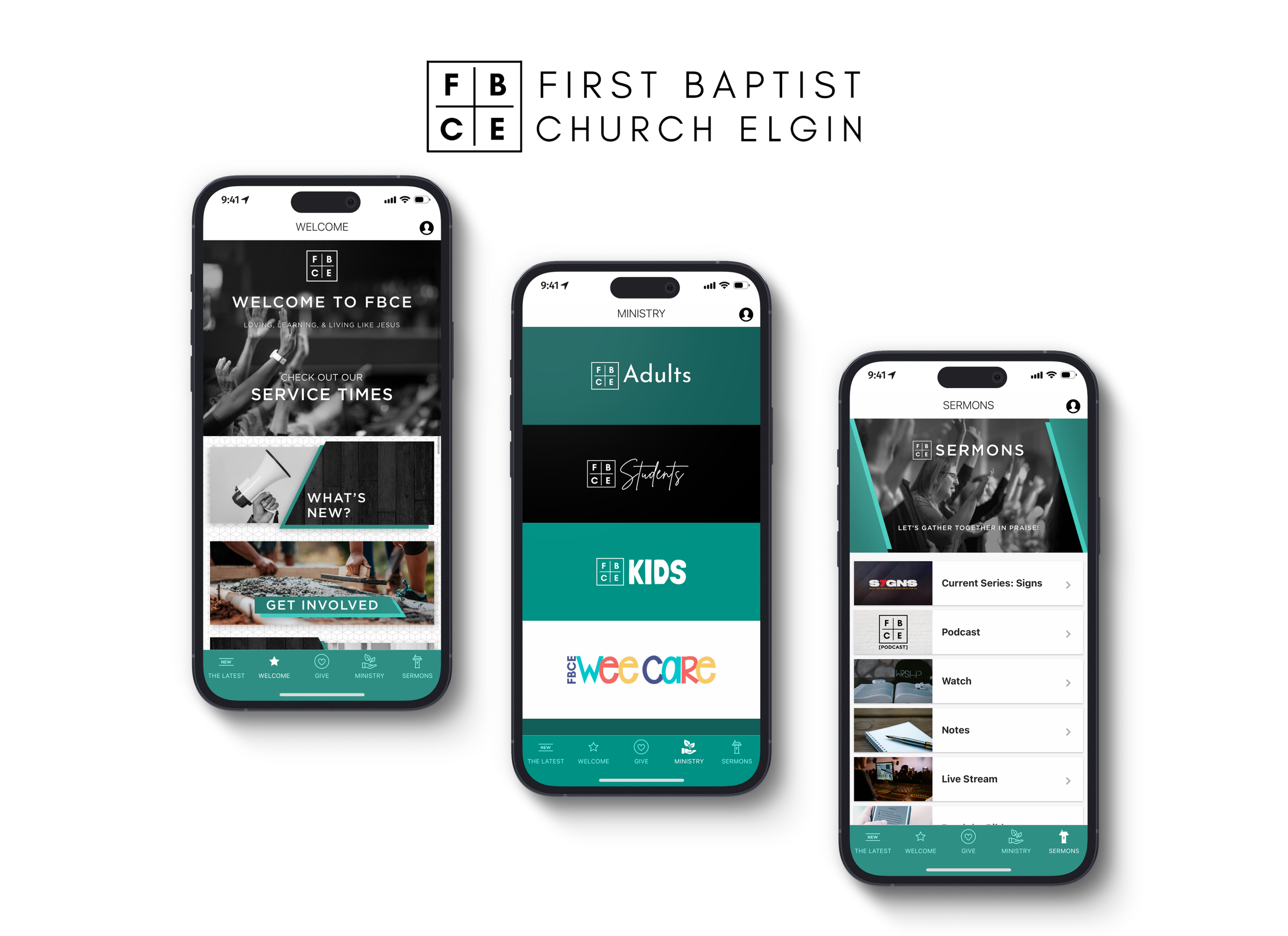
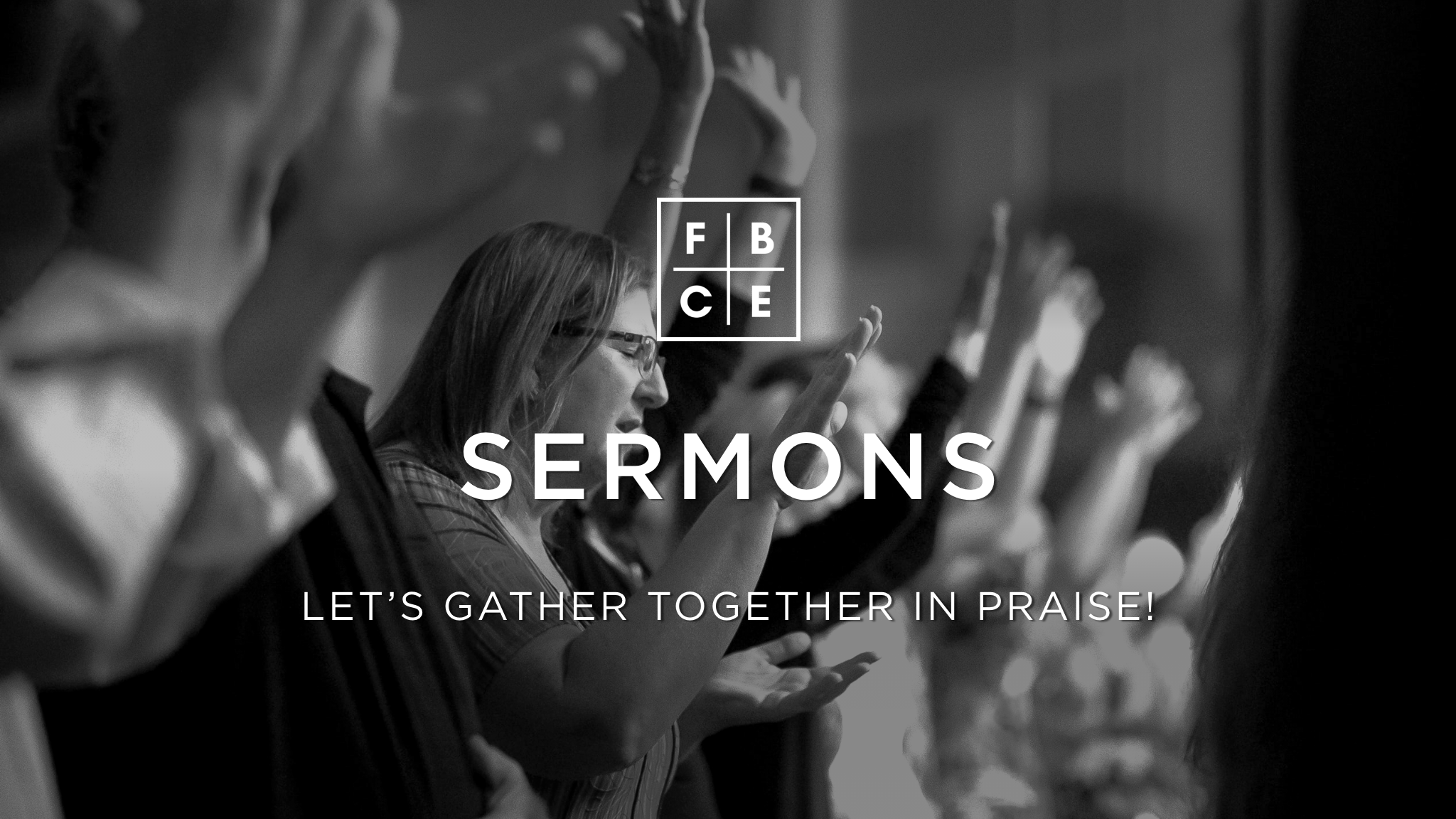
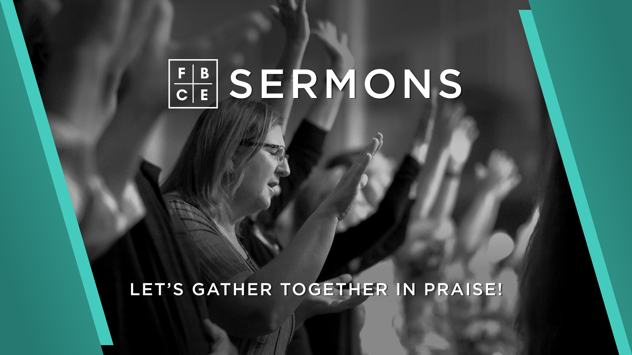
I shifted focus over to the SERMONS section of the app, where the FBCE’s podcast, recorded Sunday services videos, and other media related items lived. I decided to add a 16x9 menu layout as I wanted the customer to see the different menu options that were available within the Mobile App Studio.
My first iteration of the SERMONS container image didn’t feel right, even though I added some design elements from the panoramic menu layout. It felt lazy and out of place.
In my second iteration, I decided I wanted to replicate the look of the first image being used in the panoramic menu layout. While I was getting closer, it still didn’t look right.

FIRST ITERATION
SECOND ITERATION
I thought back to the App Discovery Call and what the customer liked about the app examples I showed him previously. He wanted to go for sharp and diagonal graphics, which is what I did in the panoramic layout. I thought about how to reuse those elements in the container image without doing a simple copy and paste.
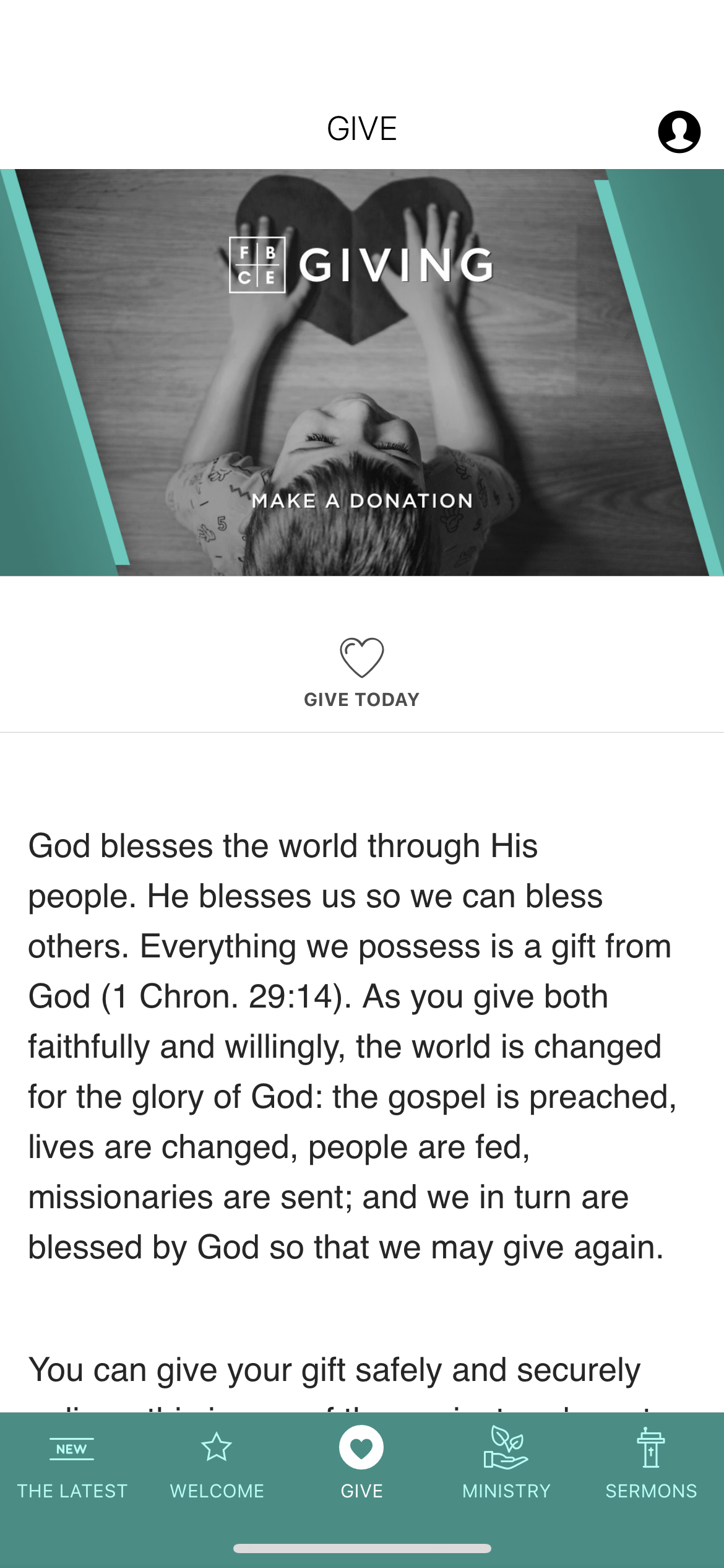
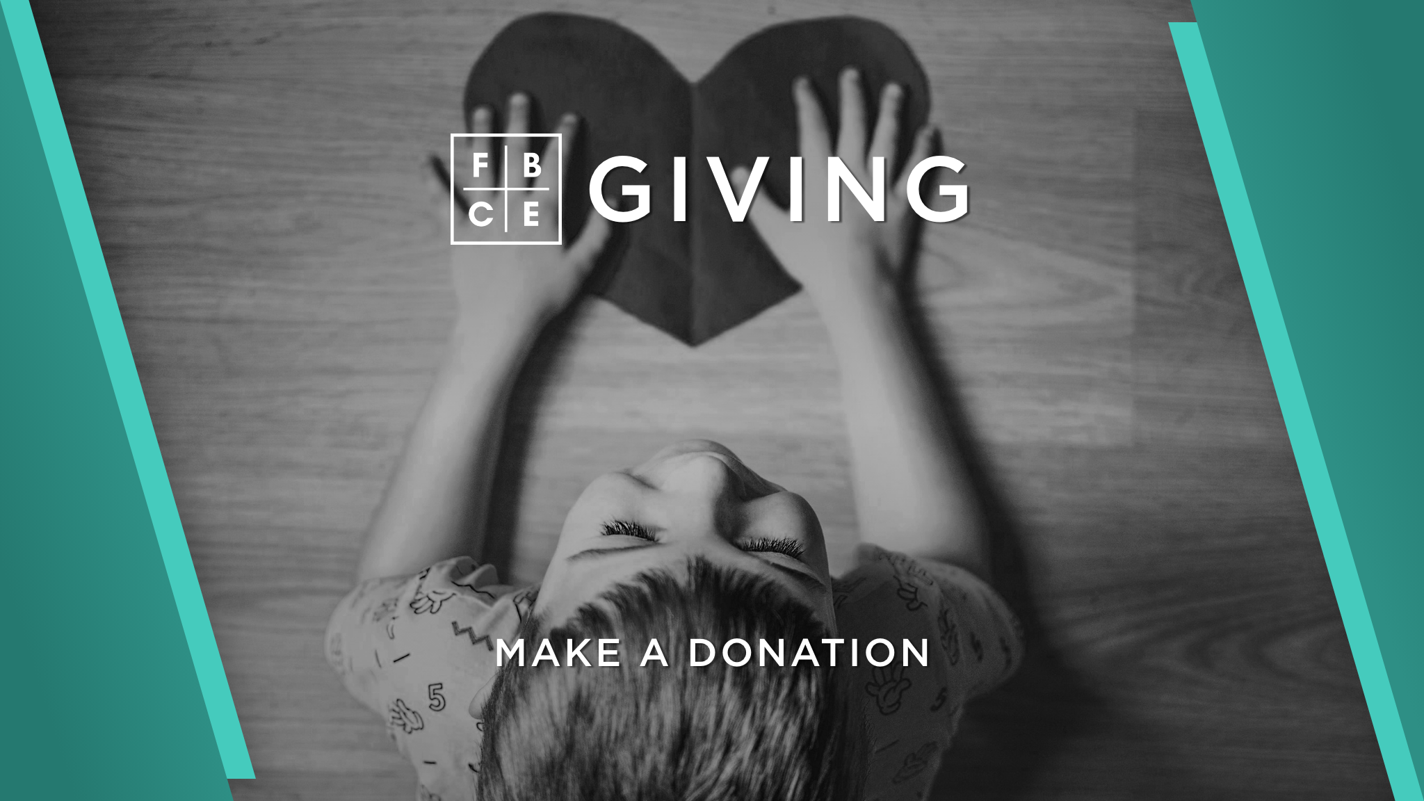
I reused the green shapes in the container image in a different way and then added the FBCE logo to align with the branding of the first image in the panoramic layout. I felt much more confident in my final choice for the SERMONS image and did the same with the GIVING container.
FINAL VERSIONS
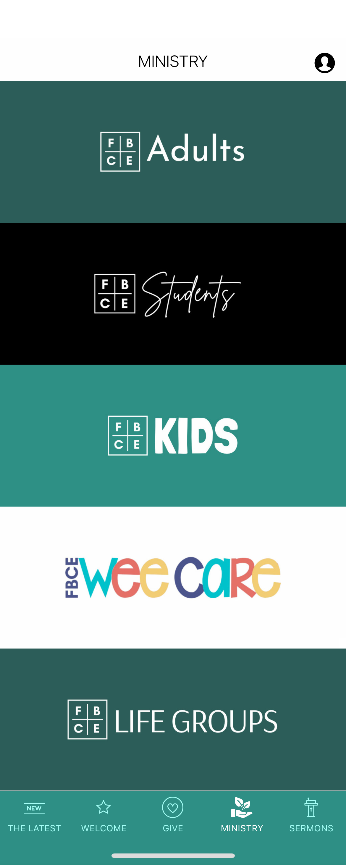
For the MINISTRY section, I wanted to use another panoramic layout, but make it simpler. FBCE already created wordmarks for their Student and Children’s ministries, so I did the same for the other ministries using different fonts and alternating background colors.

WHAT THEY MADE

WHAT I MADE


Third Stage: App Walkthrough
After double checking my work and having a team member do a quality check, I was able to complete the app build and wait for my walkthrough call with the customer.
During the walkthrough call, I shared my phone screen in the google hangout meeting so the customer could see what the end-user experience would look like. I went through each screen of the app and explained to the customer my reasoning as to why I placed items where they were and why I designed them a certain way. He was pleased with my work and did not request any changes, which was great news to me!
The FBCE app is currently live in the Google Play and App Store.